
Neon Pop
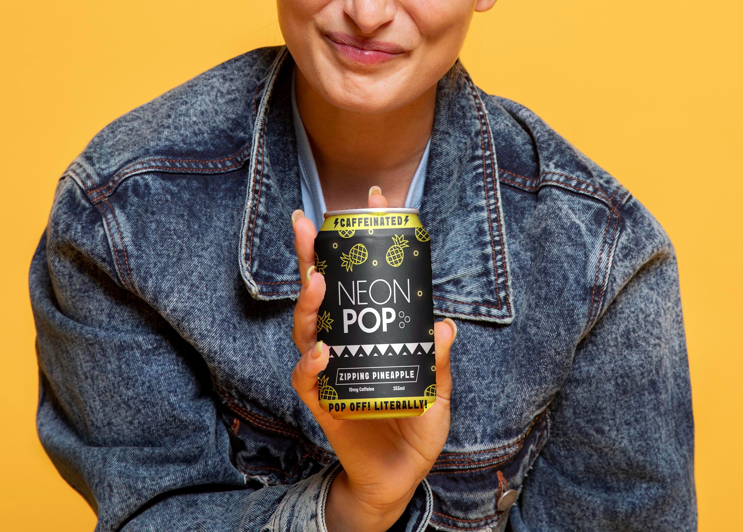
Neon pop is a brand that can be defined in four words: bold, retro, energizing, caffeinated. The inspiration for the brand comes from the 80s and 90s era featuring elements like punchy flavours and flashy confidence designed to help them stand out on shelves. Neon pops focus is to provide teens and young adults with energy needed to fuel their days. Rooted in nostalgia from the 80s but designed to be modern Neon pop embraces bold expressive visuals with high impact energy.
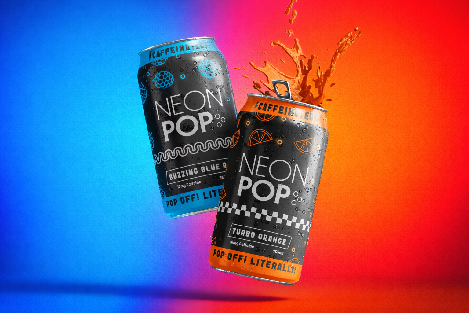
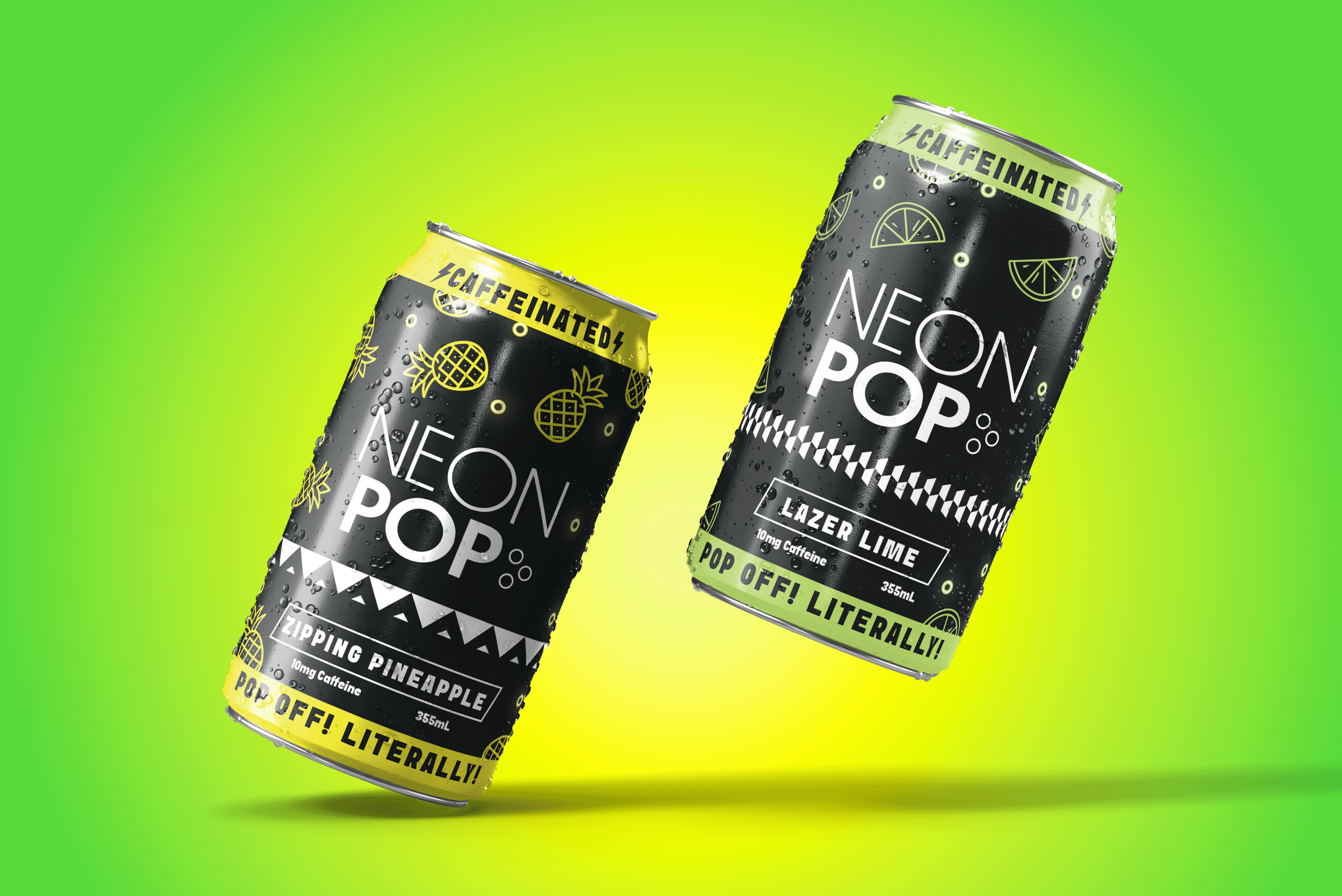
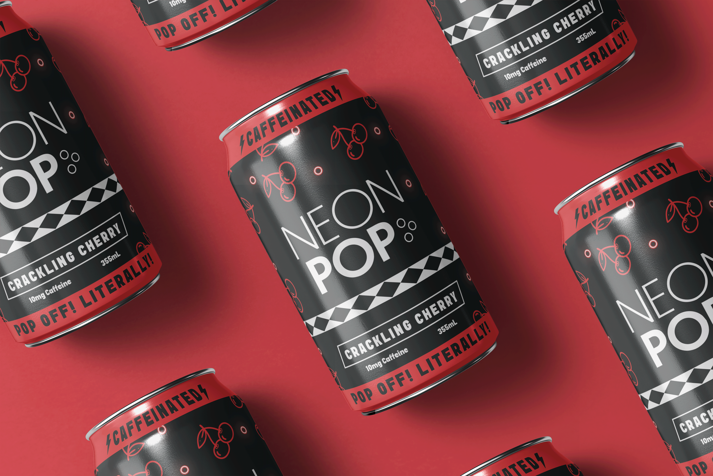
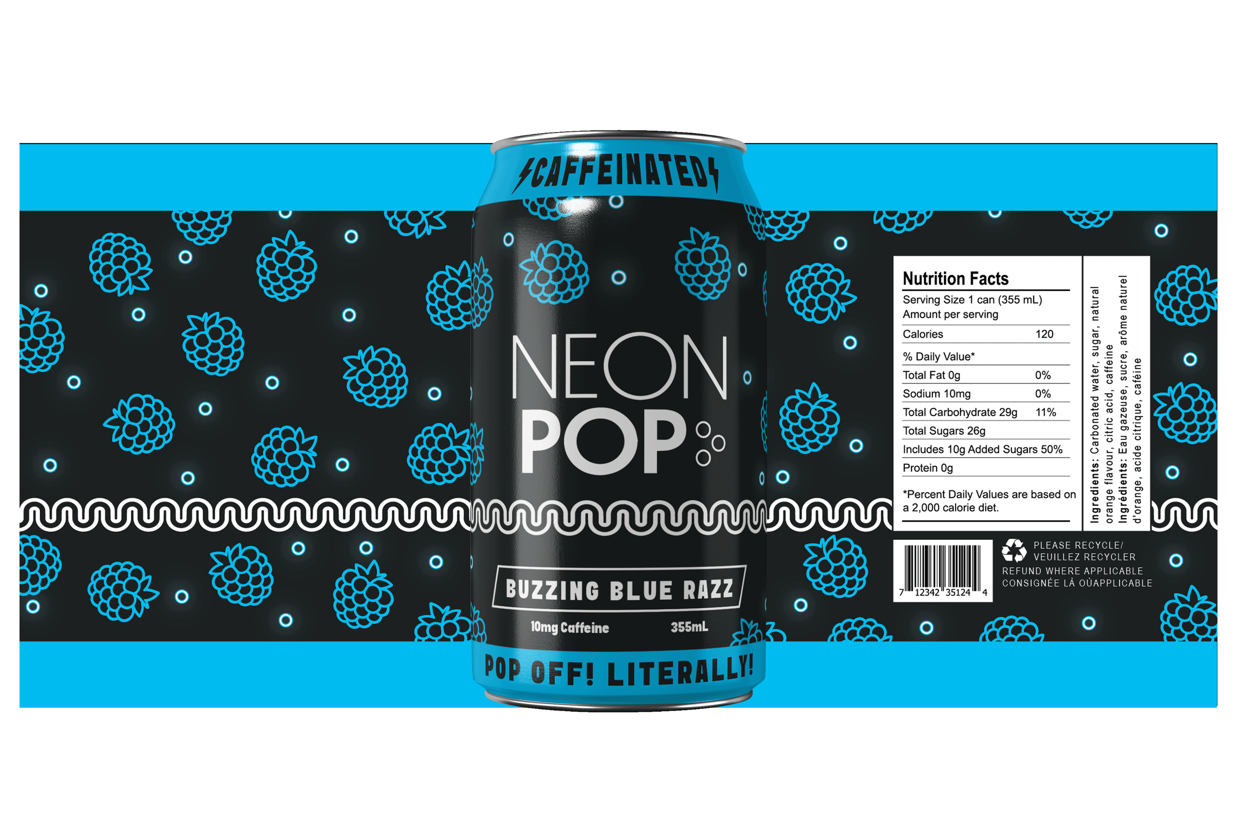
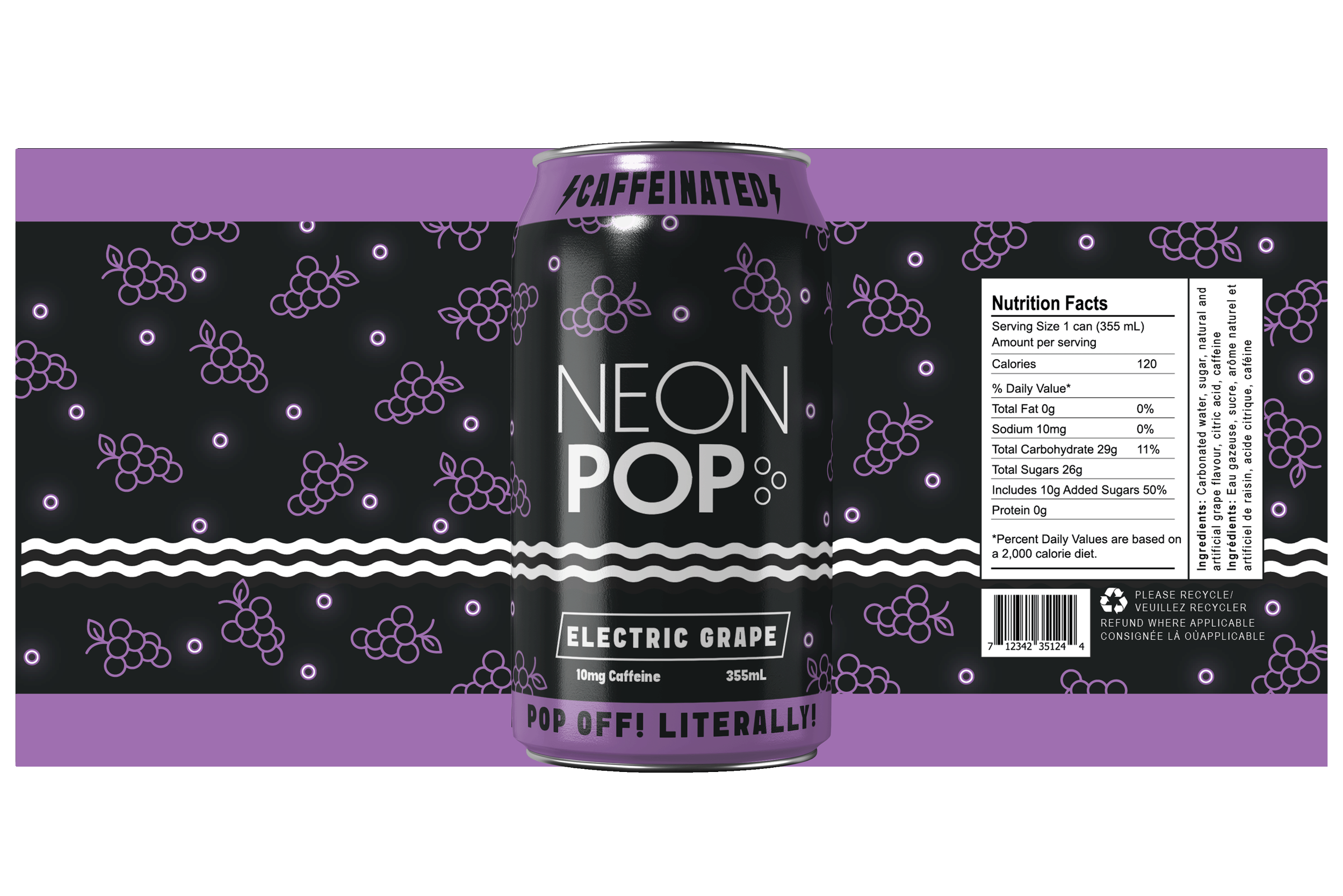
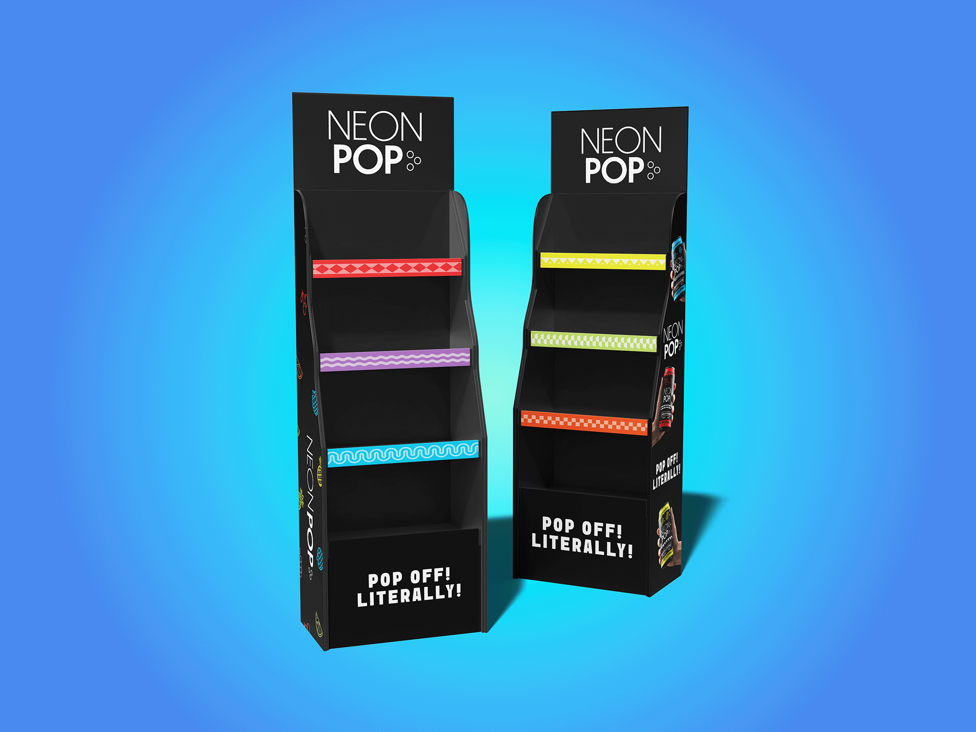
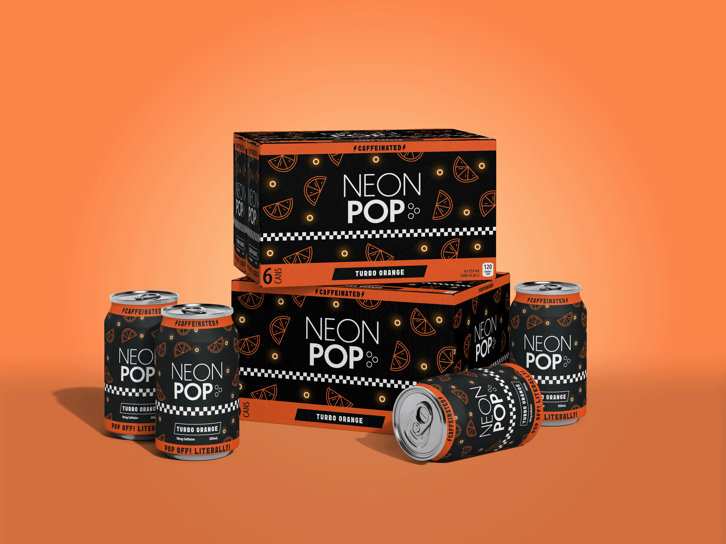
The goal of the project was to create a high-impact label that could be adapted for multiple flavours. The feeling of the cans was intended to be ‘energetic and unapologetically fun.’ Inspired by the 80s, the design was to include geometric patterns, strong contrast, and loud colours. The design required the use of a black and white base, minimal fine details, and a single bold pattern per flavour. Caffeination being a large selling point was to be placed on the front of the can.
Product Packaging
The project began with moodboard development which was heavily inspired by 80s arcade culture, mainly focused on neon signage and floor patterns, key association to the era—at least coming from a 20 year old. Additional inspiration came from simple fruit illustrations and nostalgic partners.
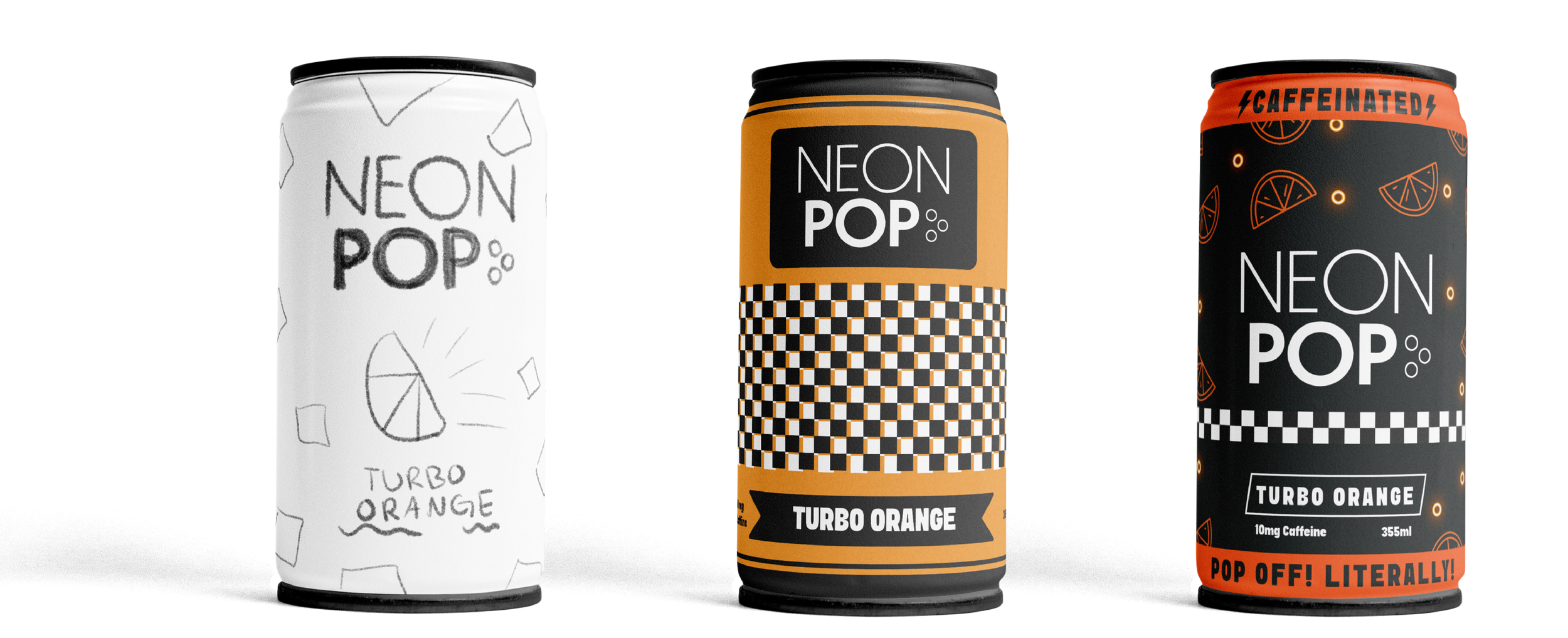
The initial design concept centered around using 80s patterns and breaking them up, creating a floating pattern that wrapped the can, with a single central fruit as a focal point. While the early iteration communicated retro, it lacked the energy, movement, and playful neon quality central to the brand.
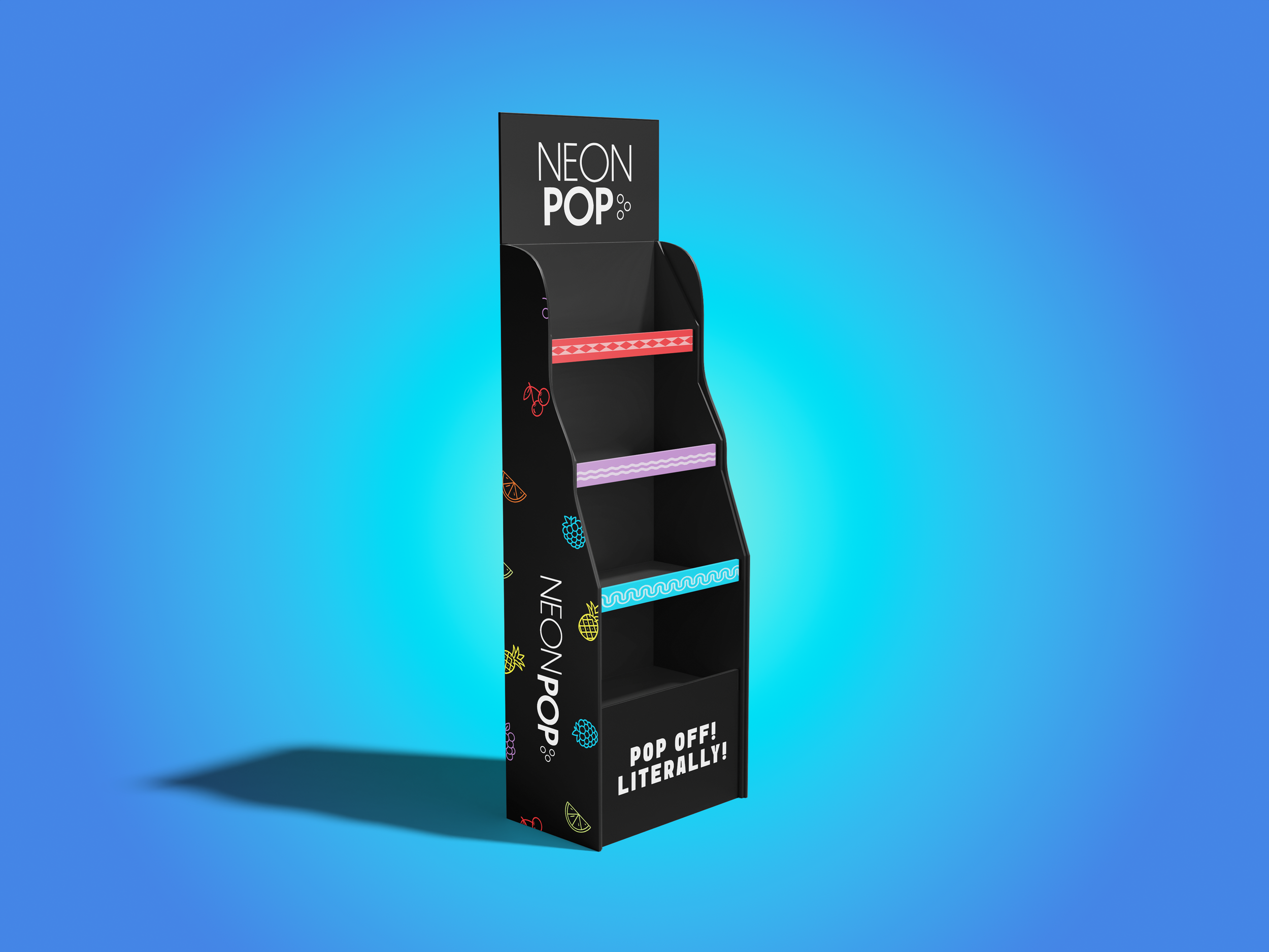
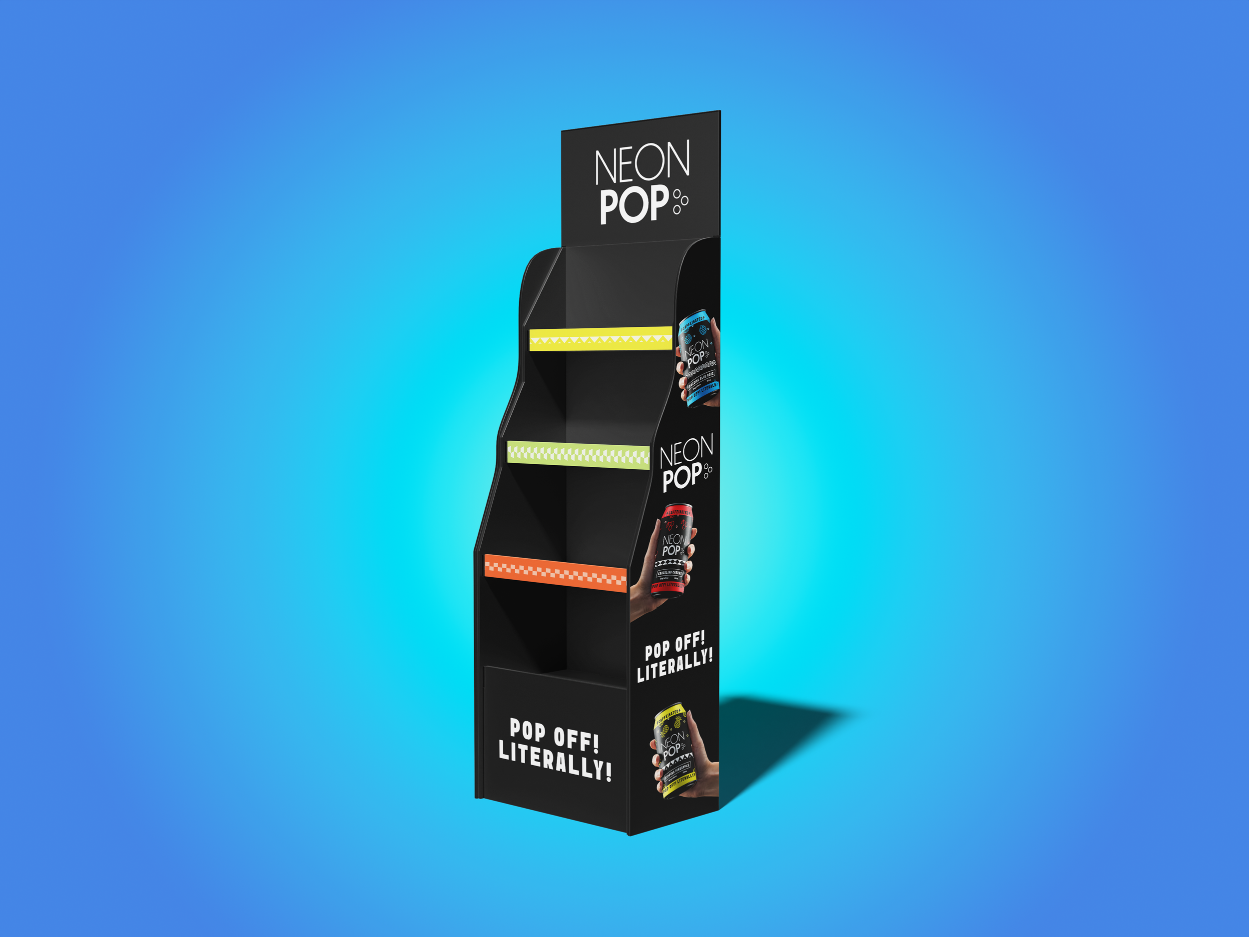
In the final design movement was reintroduced through a refined pattern to wrap the can including fruit illustrations, and circles connecting back to the brands logo and arcade floor patterns. Contrast the heightened by shifting the cans base colour to black and layer bright colour on top. To enhance brand experience and memorability each flavour was assigned a unique pattern positioned just below the logo for quick visual recognition of flavours, alongside a brand slogan “Pop off! Literally!
Process
Your
Turn
Whenever your ready
If you’d like to start a project, collaborate, or just talk design, I’d love to hear from you.